Contents
1. What this window is for and who sees it2. One date range — which box shows which period3. Colors say only three things4. Arrow and percentage — what they are compared with5. Cash position and 13-week forecast6. Sales and gross profit of the last 12 months7. Distance to this month's target8. Receivables aging9. Customer concentration10. Order funnel11. Production pulse12. Stock health13. Attention — at most 5 warnings of the day14. TV mode15. On the phone16. Speed, Refresh and "no data yet"17. Frequently asked questionsHelp › Reports › Owner Dashboard
Owner Dashboard — A Guide from Scratch
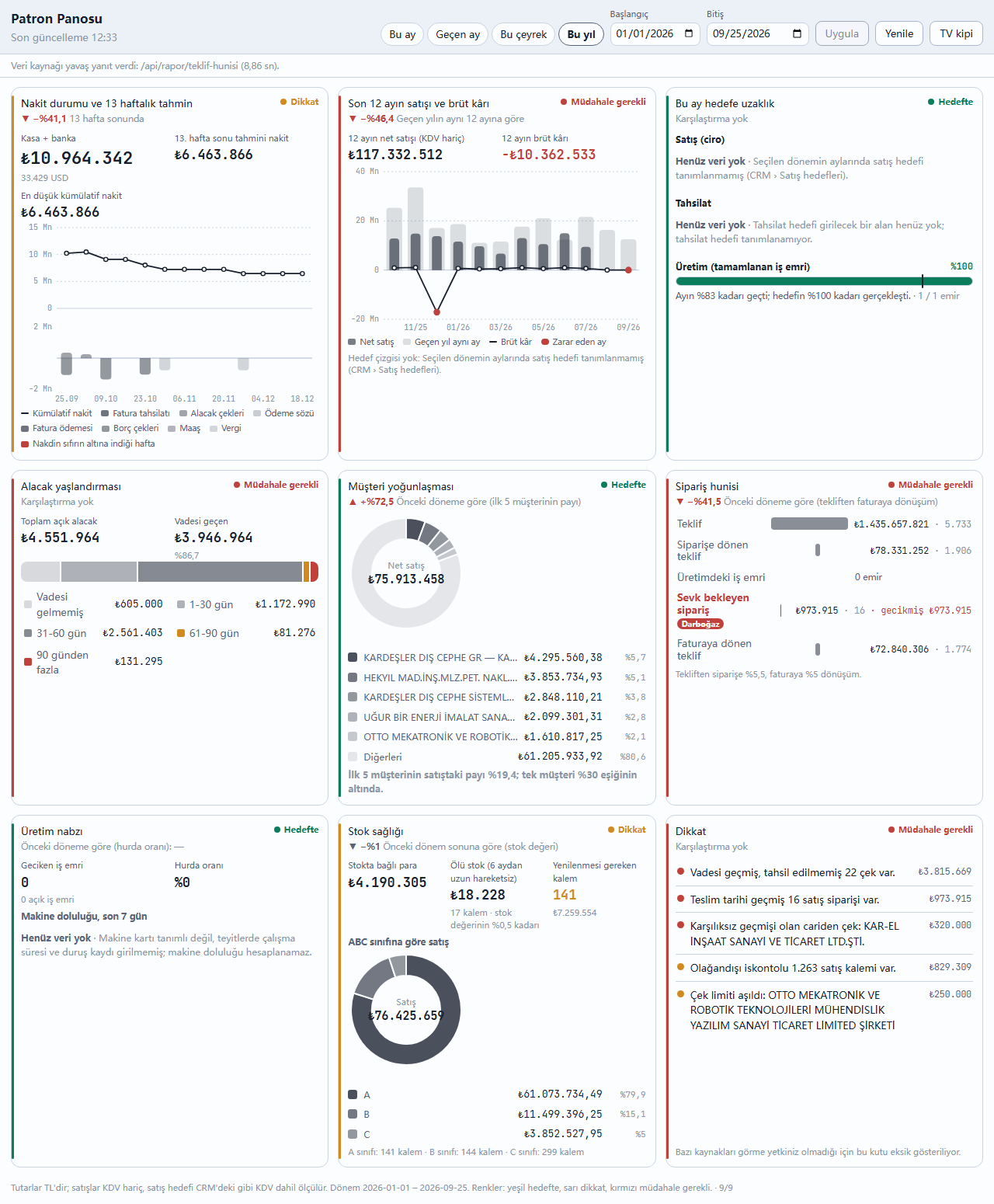
Every morning a business owner first asks four questions: will my cash last, where are sales heading, who owes me money, where are we stuck? The answers are already in the program but scattered across ten separate reports. The Owner Dashboard gathers them on one screen, in nine boxes. No box makes a new calculation: every figure comes from a company report in the Reports window or from the related window's own measure, so the figure on the dashboard and the figure in the report are always the same. Clicking a box opens the report its figure comes from. The dashboard writes no records.
1. What this window is for and who sees it
In the dock the window is inside the Management / HR tile, right next to Management. The screen shows nine boxes in three rows: 1 cash position and 13-week forecast, 2 sales and gross profit of the last 12 months, 3 distance to this month's target, 4 receivables aging, 5 customer concentration, 6 order funnel, 7 production pulse, 8 stock health, 9 attention (today's warnings).
The dashboard is visible to the system administrator or to a user whose user card has BOTH the General reports and Chart reports permissions switched on. This rule lives on the server: a user without these permissions does not see the window in the dock and gets no data even when calling the address by hand. If you additionally lack permission for a box's source (e.g. bank, cheques, production), only that box or that part of the box says "no permission"; the other boxes keep working.
2. One date range — which box shows which period
The top strip has a single date range (default: first day of this month → today). Shortcuts: This month, Last month, This quarter, This year. After changing the dates by hand press Apply; no query is sent while you type. Some boxes show "right now" by nature and are not affected by the range:
| Box | Period shown |
|---|---|
| Cash position | Today's cash + bank balance and 13 weeks from today (independent of the range). |
| Last 12 months | 12 months back, including the end month of the range; the shaded columns are the same months one year earlier. |
| Distance to this month's target | The month of the range's end date (full-month target, actual to date). |
| Receivables aging | Today's open receivables (independent of the range). |
| Customer concentration, order funnel, scrap rate, ABC | The selected range. |
| Machine utilization | The last 7 days up to the end day of the range. |
| Stock value and dead stock | Stock on the end day of the range (with movements up to that day). |
| Attention | Today's warnings; the discount warning uses the selected range. |
3. Colors say only three things
On the dashboard color is not decoration; it carries only three meanings: green = on target, yellow = attention, red = action needed. The columns, lines and slices of the charts are in shades of gray; if something is red (a week going negative, a loss-making month, a bottleneck, receivables over 90 days) you need to look at it. The dot in the top-right corner of each box and the strip on its left edge show the box's overall state. Thresholds:
| Box | Green | Yellow | Red |
|---|---|---|---|
| Cash | Net flow positive over 13 weeks | Net flow negative but cash does not fall below zero | Cash below zero in at least one week |
| Last 12 months | Sales higher than in the same 12 months last year | At most 10% lower | More than 10% lower |
| Distance to target | Achievement rate has caught up with the elapsed part of the month | At least 90% of the elapsed part of the month | Further behind |
| Receivables | Overdue share at most 20% | At most 40% | More than 40% |
| Customer | No single customer makes 30% of sales or more | — | A single customer makes 30% or more |
| Order funnel | Loss/blockage does not exceed 25% at any stage | 25-50% | One stage at 50% or more (bottleneck) |
| Production pulse | No delayed orders, scrap did not increase | Scrap rate increased | There is an open work order past its due date |
| Stock health | Dead stock below 10%, no items to replenish | Dead stock 10-20% or there are items below minimum | Dead stock 20% or more |
| Attention | No warnings | Only attention warnings | At least one action-needed warning |
4. Arrow and percentage — what they are compared with
Under each box's title there is an arrow (▲ ▼) and a percentage, with a note on what it is compared with. The arrow's color tells whether the change is good or bad: a sales increase is green, a scrap increase is red; a change that is neither good nor bad, such as stock value, stays gray. Boxes that show a current state (receivables aging, attention) say "No comparison" because no history is kept; the arrow in the cash box compares 13 weeks ahead with today, not with the previous period.
5. Cash position and 13-week forecast
The big figure is cash + bank: today's balance of the TL cash and bank accounts (the same as the total in the Bank window; foreign-currency accounts are shown separately below and are not mixed into TL). The line at the top is the cumulative cash forecast for the next 13 weeks; the bars below it are each week's inflows (above the axis: invoice collection, cheques receivable, promise to pay) and outflows (below the axis: invoice payment, cheques payable, salary, tax). The week in which cash falls below zero is shown in red with a band and a red date. The calculation is the same as the Reports › Finance › 13-week cash forecast report; clicking the title opens that report, clicking "Cash + bank" opens the Bank window. Overdue receivables and payables are not spread over the weeks because it is unknown when they will be paid.
6. Sales and gross profit of the last 12 months
The dark columns are each month's net sales (excl. VAT, returns deducted), the light shaded columns behind them are the same month last year, and the line is that month's gross profit. The dot of a loss-making month is red. If a sales target has been entered in CRM, the month's target is drawn as a dashed line (the target is measured as in CRM, by invoice amount including VAT). Sales = Reports › Sales › Sales analysis (by month), profit = Profitability ranking (each month is calculated separately; unit cost is that month's average purchase price). Clicking a month opens that month's profitability ranking. If profit is strongly negative, the cause is usually a stock card with a wrongly entered cost; the "least profitable" table of the profitability report shows which card it is.
7. Distance to this month's target
There are three bars: sales (CRM sales targets; target achievement rate), collection and production (how many of the work orders opened this month have been completed). The thin vertical line on the bar shows how much of the month has passed; the sentence below states both side by side, e.g. "60% of the month has passed; 48% of the target has been achieved". If the bar has reached the vertical line it is green, slightly behind is yellow, far behind is red. The program does not yet have a field for entering a collection target; this bar says "No data yet". If no sales target has been entered, the sales bar also says "No data yet" and states the reason.
8. Receivables aging
A single horizontal strip splits the open receivables into five slices by due date: not yet due, 1-30 days, 31-60 days, 61-90 days (yellow) and more than 90 days (red) overdue. Clicking a slice or the row below it opens the top 5 accounts by amount owed in that slice; clicking an account opens its account card. The figures are the same as the Reconciliation › Receivables Ageing view; clicking the title opens that view.
9. Customer concentration
The ring shows how net sales in the selected range are split between the top 5 customers and the others. If a single customer makes 30% of sales or more the box is red: losing that customer would shake the business. The arrow is the change in the top 5 customers' share compared with the previous period (a falling share is good). Source: Sales analysis (by customer); clicking the title opens it.
10. Order funnel
Five stages: quotation → quotations converted to orders → work orders in production → orders awaiting shipment → quotations converted to invoices. The quotation, order and invoice amounts track the quotations in the selected range (Quotation funnel report); the production stage is not an amount but the number of open work orders; awaiting shipment is the amount of open sales orders not delivered as of today (Open sales order aging report). The stage where the most business is lost or waiting (a loss or blockage share of 50% or more) gets the red "Bottleneck" badge. Clicking a row opens that stage's report.
11. Production pulse
The heat map shows each machine's utilization over the last 7 days (working minutes ÷ the machine's daily capacity; a dark cell is a busy machine). Weekends and days without capacity show "—". Next to it are delayed work orders (open orders past their due date; red) and the scrap rate of the selected range. If daily minutes are not defined on the machine cards and no working time is entered in production confirmations, utilization cannot be calculated; the box states the reason.
12. Stock health
Four measures: money tied up in stock (Stock valuation report), dead stock (the value of items with no outgoing movement for more than 6 months and their share of stock value — Dead stock report), items to replenish (the number of items that have fallen below their minimum level and the amount of the suggested purchase — Stock below the minimum level report) and the split of sales in the selected range into ABC classes. Clicking a measure opens its own report. An item whose cost is unknown is not included in the value; the report lists which items they are.
13. Attention — at most 5 warnings of the day
Warnings from different parts of the program are gathered in one list, sorted by amount with the red ones first, and the five most important are shown: an overdue cheque or one received from an account with a bounced-cheque history, an account over its cheque limit, a bank account in negative balance, a sales line with an unusual discount, a sales order past its delivery date, a work order that will miss its due date or is stuck, an official obligation that is overdue or due within 7 days (including last month's returns), a pending approval request, and, for administrators, suspected duplicate purchases / documents deleted and rewritten. Clicking a row opens the related window. If there are no warnings the box is green.
14. TV mode
To show the dashboard on a wall screen press the TV mode button in the top strip: the window goes full screen, the text grows, the nine boxes fit on one screen, and the clock and the next refresh time appear in the corner. The dashboard refreshes itself every 10 minutes. To leave press Esc or "Exit TV mode". If the screen is shorter than 900 pixels the boxes do not fit; TV mode then works with scrolling.
15. On the phone
On the phone (Garden + Steps interface) the nine boxes are stacked in a single column in the same order; the date shortcuts scroll sideways and the buttons are large enough to press with a finger. TV mode is not available on the phone.
16. Speed, Refresh and "no data yet"
The boxes do not wait for each other: each one is drawn as soon as it is ready; if one box's source fails, only that box says "This box could not be loaded" and a Try again button appears. Results are kept in memory for 60 seconds; Refresh bypasses this memory and recalculates everything. If a source took longer than 5 seconds, the top strip says so. Where there is no data the dashboard does not print 0: it writes "No data yet" and gives the reason (e.g. "There are no net sales in the selected period", "No machine card is defined").
17. Frequently asked questions
- The figure on the dashboard differs from the report. It should not: the dashboard calls the report itself. The only cause of a difference is the period — which period each box shows is in section 2; clicking the box opens the report with the same period.
- Is the sales box excluding VAT and the target including VAT? Yes: sales amounts are calculated from the lines excluding VAT; the sales target uses the same definition as the CRM screen (invoice amount, including VAT).
- Why is the collection target always empty? The program does not yet have a field for entering a collection target.
- Where is "order over limit"? The attention box currently shows accounts over their cheque/risk limit; there is no credit limit report per order.
Morning summary notification. The figures in the dashboard boxes can also arrive every morning as a short message: yesterday's sales, yesterday's collections, cash and bank, amounts due today, overdue orders, critical stock, late orders, pending approvals and yesterday's anomalies. The summary is read from the same source as these boxes. Details: Notification and Approval Center › Morning summary.
Related guides: Reports — company reports · Mobile.